
The MOMENT that DECIDES Everything
Picture this: It’s 9:42 AM in Austin. A VP of Procurement, Laura Kent, is comparing three B2B vendors offering supply chain automation. With just ten minutes between calls, she opens each company’s website in a new tab. The first one overwhelms her with jargon, the second one is beautifully designed but slow to load, and the third gives her exactly what she’s looking for—a concise promise and a clear next step. That third company wins the call, the demo, and eventually the deal.
The Myth of “Pretty = Powerful”
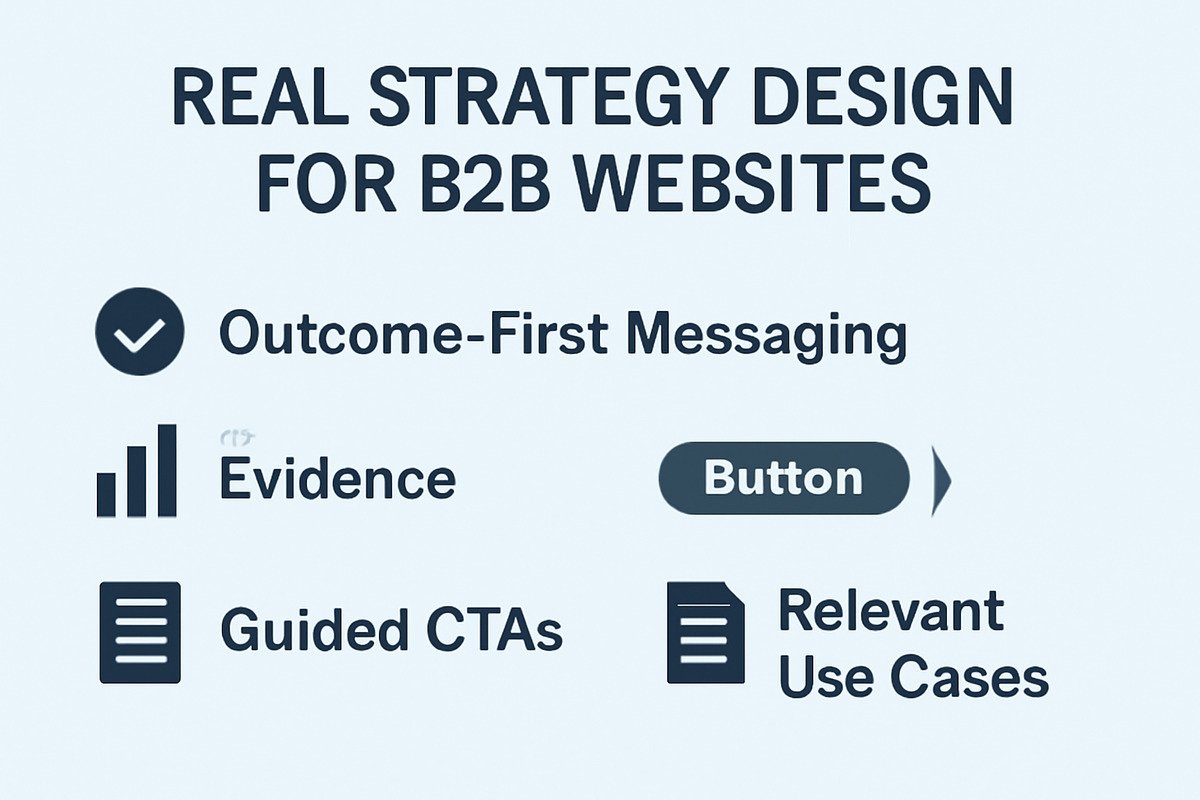
Many businesses mistake visual flair for digital persuasion. In reality, successful B2B websites don’t aim to impress—they aim to guide. They direct decision-makers like Laura toward clarity, confidence, and action. What separates high-converting B2B websites from their bloated, portfolio-heavy counterparts is a sequence: outcome-first messaging, evidence, guided CTAs, and relevant use cases. Design supports strategy—not the other way around.
Real Agency Strategy: Outcome, not Output
Top-tier B2B web design agencies focus first on the business result, not on the layout. Instead of asking, “What color should the buttons be?” they ask, “What conversion metric matters most—demos, downloads, or sales-qualified leads?” From there, they reverse-engineer the content and flow. For example, if the goal is to book demos, then every major page should include a simplified scheduling tool, a social proof nudge, and an expectation-setter like “15-min discovery, no pitch.”
How RailSync TRIPLED Demo Bookings
When RailSync, a freight tech startup, struggled to turn site traffic into sales calls, they turned to a B2B agency called Summit Conversion Partners. The agency removed fluffy copy and replaced it with a crisp headline: “Automate 70% of your rail logistics in 6 weeks.” Instead of a generic ‘Learn More’ button, they offered two CTA buttons: “Watch 90-sec demo” and “Estimate your savings.” Case studies were condensed into scannable proof tiles. Within two months, the site tripled its demo bookings without increasing traffic.
Make Proof feel Personal
Buyers want to know, “Has this worked for someone like me?” Instead of long-winded testimonials, high-growth agencies recommend short, specific endorsements paired with names, roles, and industries. A quote like, “Saved us 18 hours a week in manual freight tracking — Lisa H., Ops Director, Midwest Freight Co.” does more work than a vague five-star graphic ever could. These agencies also often convert deeper case studies into shareable PDFs—perfect for internal champions who need to circulate solutions.
Structure Content like a Buying Journey
The site’s structure should mirror a real-life sales conversation. The homepage introduces the core promise. Next, the solutions page breaks down pain points by buyer persona or industry. Proof follows in the form of client results or before/after metrics. Then comes process—how it works, how long it takes, and what support looks like. Finally, pricing expectations (ranges or models) and a low-friction CTA like “Request a 15-min roadmap.”
CTAs aren’t JUST buttons—they’re Micro-conversions
Instead of just “Contact Us,” break down CTAs by intent level. Offer a content upgrade (like a checklist or tool), a short discovery session, or even a feasibility audit. When Marco Ruiz, CTO of a robotics firm, saw a $2,500 “AI Logistics Audit” offer that included deliverables and turnaround time, he signed immediately. That one audit led to a $75k implementation contract.
Best Practices from Real B2B Web Agencies
- Use messaging sprints to test taglines with real users before writing headlines.
- Build a trust stack: logo wall → metric quote → case teaser → case download.
- Map user journeys from homepage to CTA in under 4 clicks.
- Offer pricing ranges with qualifying context: “Most clients invest $12k–$35k for full implementation.”
The Role of Your Homepage Hero
The hero section is the first—and sometimes only—thing a visitor sees. If it’s vague, fluffy, or self-centered, your bounce rate will reflect that. Instead, lead with a benefit-driven headline, a sharp subhead that clarifies the audience, and two tiered CTAs: one for those in research mode, and one for buyers ready to talk. Include subtle trust elements—such as a client logo carousel or a one-line client result—without overwhelming the visual hierarchy.
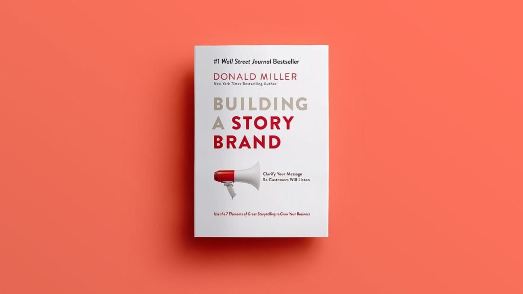
Building a StoryBrand by Donald Miller is a must-read for anyone looking to refine their messaging, especially for B2B websites. Much like the principles outlined in this blog, the book emphasizes clear, outcome-driven messaging that connects with your audience. Miller’s approach aligns perfectly with the idea that successful websites focus on clarity and action, guiding visitors towards understanding how your service or product can solve their problems. It echoes the need for simplified messaging that resonates with potential customers, ensuring they feel confident in their decisions.
What Great B2B Pages all have in Common
They respect the visitor’s time. Each page focuses on one primary question and uses visual cues to guide the eye. Icons aren’t decorative—they support scanning. Button labels don’t say “Submit”—they say “Show me how it works” or “Let’s talk.” And every scroll brings either clarity, confidence, or next steps.
Checklist for Your Internal Review
- Does each page have a single conversion goal?
- Are trust signals within view—not buried in footers?
- Can a visitor answer “Is this for me?” within 5 seconds?
- Is there a CTA for top, middle, and bottom-funnel prospects?
FAQs (People Also Ask)
1. What is a B2B web design agency?
A B2B web design agency specializes in creating websites for businesses that sell to other businesses. Their focus is on lead generation, clear messaging, buyer journeys, and professional branding tailored to multi-stakeholder decisions.
2. How much does a B2B website cost in 2025?
Prices typically range from $10,000 to $75,000 depending on features, integrations, content, and agency expertise. Strategy, CRO, and custom development can raise the price.
3. What should a B2B website include to convert leads?
Key elements include a clear headline promise, segmented content, client proof, buyer-aligned CTAs, and a frictionless demo or consultation path.
4. How do B2B sites differ from B2C websites?
B2B sites prioritize trust, logic, and multi-touch buying journeys, while B2C sites often emphasize speed, emotion, and impulse-friendly layouts.
5. How can I tell if a B2B web agency is right for me?
Check their past client results, their familiarity with your industry, how they scope deliverables, and whether they prioritize ROI over visual design fluff.
Final Word
The best B2B websites aren’t designed to win awards. They’re designed to help your future customer say, “This is exactly what we need.” If you’re working with an agency, make sure they’re not just building pages—but building buyer confidence. And if you’re rebuilding in-house, start with empathy, clarity, and results. That’s the formula for a site that doesn’t just look good—IT SELLS.